Avatar
A compact identity marker for people and accounts.
pnpm dlx shadcn@latest add @uiarc/avatarLive · keyboard ready
- Showing one person next to their name, comment, or record.
- Presence in a header or list, via the online or offline status dot.
- Places where a photo may be missing and initials should stand in.
- Use avatar-group for several people with an overflow count.
- Use user-menu when the avatar is the trigger for account actions.
Installation
Add Avatar with the shadcn CLI, or copy the source by hand.
pnpm dlx shadcn@latest add @uiarc/avatarAdds the component and its local dependencies, and installs motion. First time? Add the @uiarc registry to components.json, or use the full URL:
example.tsx
import { Avatar } from "@/components/arc/avatar/avatar"; export function Owner() { return <Avatar name="Maya Chen" src="/people/maya.jpg" size="lg" status="online" />;}Avatar
A round portrait that falls back to initials and can show an online or offline dot.
PropTypeDefaultDescription
nameRequiredstring–Full name. Used for the accessible label and the first two initials.srcstring–Image URL. Renders a plain img, or the image component set with ArcProvider (such as next/image). Falls back to initials if it fails to load.size"sm" | "md" | "lg" | "xl""md"Diameter, from 28px to 88px.status"online" | "offline"–Adds a presence dot and appends the status to the label....propsHTMLAttributes<HTMLSpanElement>–Forwarded to the root span, including className.- The root is role="img" with an aria-label of the name plus status, such as "Maya Chen, online".
- The image and initials are decorative, so the name is read once.
- The status dot is hidden from assistive tech; the label carries the state.
- A photo still loading fades in from a soft blur; a cached one shows at once.
- The status dot pops in and out on a snappy spring.
- Reduced motion swaps the dot instantly and drops the image fade.
- Size is fixed by the size prop, from 28px to 88px, and never changes by breakpoint.
- It passes a sizes hint per size, so with next/image (through ArcProvider) phones never download a larger photo than the circle shows.
- The photo is a plain lazy img by default. Pass next/image through ArcProvider to optimize it; remote hosts then need next.config images settings.
- A cached photo shows at once; only a still-loading photo runs the short blur fade.
Notes for AI
Give your coding assistant the Markdown reference instead of screenshots.
- Use for a single person. For a row of people with an overflow count use avatar-group.
- Renders a plain img, so any host works in any React app. To use next/image or your own image component, wrap the app once in ArcProvider from @/components/arc/lib/arc-provider: <ArcProvider image={Image}>. With next/image, remote hosts must be allowed in next.config images.
The full library index for assistants is at /llms.txt.
Split barProComponentA single 100% bar split into shares: rest on a segment to widen it and read its exact figures, toggle segments from the legend and the rest reflow, with labels inside when they fit and on leader lines when they don't.Data gridProComponentA spreadsheet grid with range selection, inline editing, a fill handle, and animated sorting.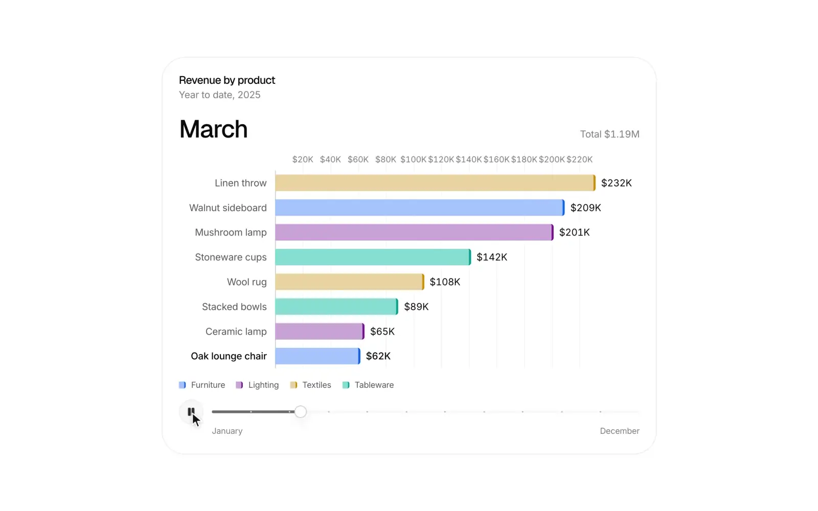 Race bar chartProComponentA ranking over time: bars overtake each other on springs, values count up, and a timeline you can play or scrub.