Badge
A small label for status, category, or metadata.
pnpm dlx shadcn@latest add @uiarc/badgeLive · keyboard ready
- Short statuses next to titles or in table cells, such as Live, Draft, or Failed.
- Counts or states that change in place and should morph instead of jump.
- Tagging a row with one tone plus an optional icon.
- Use alert or toast when the message needs a full sentence.
- Use chip-group when people toggle the values.
- Use stat-card for a headline number with a trend.
Installation
Add Badge with the shadcn CLI, or copy the source by hand.
pnpm dlx shadcn@latest add @uiarc/badgeAdds the component and its local dependencies, and installs motion. First time? Add the @uiarc registry to components.json, or use the full URL:
example.tsx
import { Check } from "lucide-react";import { Badge } from "@/components/arc/badge/badge"; export function DeployStatus({ live }: { live: boolean }) { return ( <Badge tone={live ? "success" : "neutral"} icon={live ? <Check size={12} /> : undefined}> {live ? "Live" : "Draft"} </Badge> );}Badge
A small status label in five status tones and six categorical colours whose label and icon morph in place when they change.
PropTypeDefaultDescription
tone"neutral" | "success" | "info" | "warning" | "danger""neutral"Status role. Every tone is a soft tint of its semantic token (--success, --info, --warning, --danger) with the tone as text.size"sm" | "md" | "lg""md"Height 20, 24 or 28 px with 11, 12 or 14 px text.iconReactNode–Leading icon, sized to the badge (12, 14 or 16 px) and drawn in the tone colour. A different icon component crossfades in.dotbooleanfalseLeading status dot in the tone colour. Ignored when icon is set.color"teal" | "sky" | "orchid" | "violet" | "rose" | "amber"–Categorical colour from the shared --tone-* palette, for labels such as method tags. Overrides tone.outlinebooleanfalseHairline border in the tone colour. Off by default.pillbooleanfalseFully rounded ends instead of the default 5, 6 or 7 px corners.childrenReactNode–Label. String or number children get the rolling text swap; other nodes render as is....propsHTMLAttributes<HTMLSpanElement>–Forwarded to the root span.- Renders a plain span, so it is read inline with surrounding text.
- The icon is aria-hidden; the label must state the status on its own, not rely on tone color.
- Outgoing labels are hidden from assistive tech while they fade, so only the current text is read.
- It does not announce changes. Put it inside a live region if a status update must be spoken.
- A new label rises in with a short blur while the old one lifts away, and the pill width springs to fit.
- Passive reflows such as font swaps resize instantly; only a content change springs.
- Reduced motion swaps the label with a quick fade and snaps the width.
- The pill sizes to its label and never wraps, so keep labels to a word or two in narrow cells.
- Hover styles apply only on hover-capable fine pointers.
- Each badge has a ResizeObserver for the width spring; fine per row, but avoid thousands in one table.
- Font swaps and passive reflows resize instantly; only content changes animate.
Notes for AI
Give your coding assistant the Markdown reference instead of screenshots.
- Use for short statuses and counts next to titles or in table cells. Use alert or toast for messages with sentences.
- Use dot for live states (online, syncing, down) and an icon when the shape adds meaning; the label is optically centred either way.
- Use tone for status and color for categories (GET teal, POST sky, PUT orchid, PATCH violet, DELETE rose); never use a categorical colour to mean success or failure.
- Keep the badge mounted and change its children to get the morph; remounting with a new key loses it.
The full library index for assistants is at /llms.txt.
Split barProComponentA single 100% bar split into shares: rest on a segment to widen it and read its exact figures, toggle segments from the legend and the rest reflow, with labels inside when they fit and on leader lines when they don't.Data gridProComponentA spreadsheet grid with range selection, inline editing, a fill handle, and animated sorting.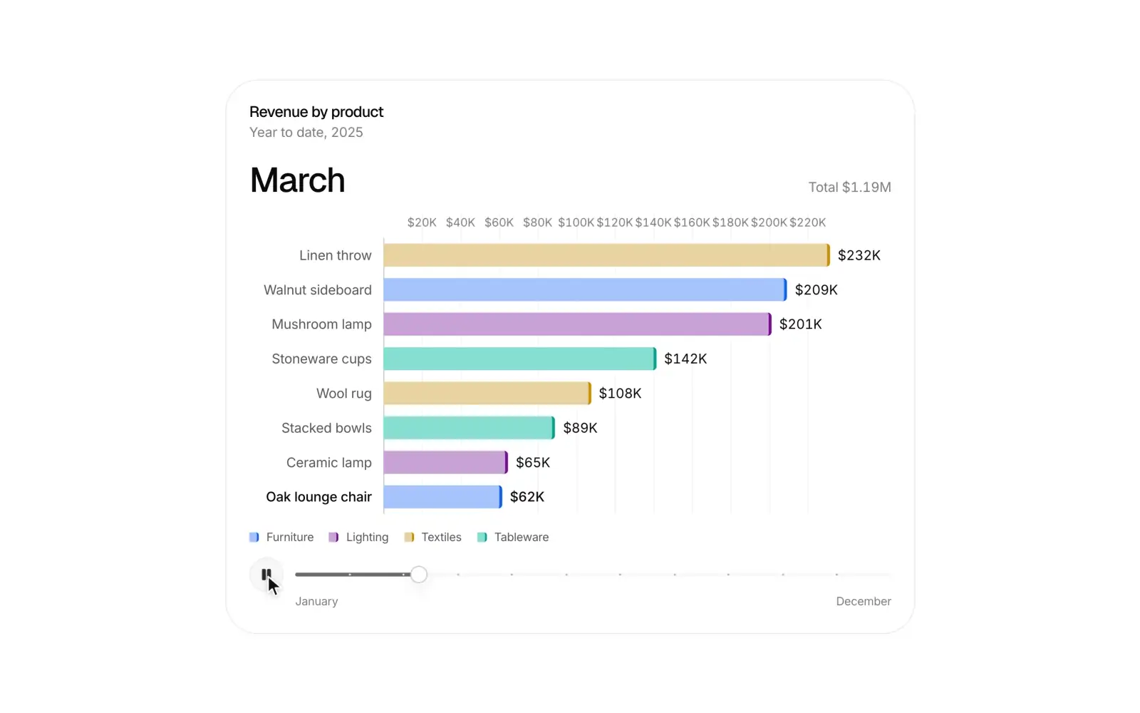 Race bar chartProComponentA ranking over time: bars overtake each other on springs, values count up, and a timeline you can play or scrub.