Site footer
A website footer with link columns and newsletter, a minimal layout, and a large fading Arc mark.
pnpm dlx shadcn@latest add @uiarc/site-footerLive block · sample data
- The closing section of a marketing, docs, or product site.
- Footers that need a newsletter signup and a status link.
- Minimal one-row footers for app shells and docs.
- Use a plain row with breadcrumb or links inside signed-in app screens.
- Use contact-section when the main goal is to start a conversation.
Installation
Add Site footer with the shadcn CLI, or copy the source by hand.
pnpm dlx shadcn@latest add @uiarc/site-footerAdds the block and its local dependencies, and installs motion, lucide-react. First time? Add the @uiarc registry to components.json, or use the full URL:
Usage
Use this as a starting point and replace the sample data with your own.
example.tsx
import { SiteFooter } from "@/components/arc/blocks/site-footer/site-footer"; export function Footer() { return ( <SiteFooter brand={{ name: "Acme", href: "/" }} tagline="Scheduling for small clinics." columns={[ { title: "Product", links: [{ label: "Pricing", href: "/pricing" }, { label: "Changelog", href: "/changelog" }] }, { title: "Company", links: [{ label: "About", href: "/about" }, { label: "Careers", href: "/careers" }] }, ]} legal={[{ label: "Privacy", href: "/privacy" }, { label: "Terms", href: "/terms" }]} newsletter={{ onSubscribe: email => subscribe(email) }} status={{ label: "All systems normal", tone: "success", href: "https://status.example.com" }} /> );}Built fromMotion
API reference
3 parts. The first is the root.
SiteFooter
A site footer in three variants: link columns with a newsletter, one minimal row, or a closing large brand mark.
PropTypeDefaultDescription
variant"columns" | "minimal" | "logo""columns"`columns` pairs a newsletter with link columns, `minimal` is one quiet row, `logo` ends in a large fading mark.brand{ name: string; href?: string; mark?: ReactNode }{ name: "Arc" }Brand shown with the tagline.taglinestring–One short line under the brand.columns{ title: string; links: SiteFooterLink[] }[]siteFooterExampleColumnsLink columns.linksSiteFooterLink[]–Links for the minimal variant. Defaults to the first link of each column.legalSiteFooterLink[]–Small links beside the copyright, such as Privacy and Terms.socialsSiteFooterLink[]–Social links.newsletter{ title?; description?; placeholder?; onSubscribe?: (email: string) => void | Promise<void> } | null–Newsletter signup. Throw or reject in onSubscribe to show an error. Pass null to hide it.status{ label: string; tone?: "success" | "warning" | "danger"; href?: string } | null–A system status link. Pass null to hide it.yearnumber–Year in the copyright line.onNavigate(link: SiteFooterLink) => void–Called for every pressed link. Links without an href render as buttons and only call this.classNamestring–Extra class on the footer.SiteFooterLink
PropTypeDefaultDescription
labelRequiredstring–Link text.hrefstring–Destination.externalboolean–Opens in a new tab and shows an outward arrow.SiteFooterBlock
Default export: a preview with a layout switcher.
PropTypeDefaultDescription
variantSiteFooterVariant"columns"Initial variant.- Renders a footer landmark with labelled link groups.
- The newsletter validates in place with a message tied to the field, and confirms without a toast.
- External links show an outward arrow and open in a new tab.
- Status tone is paired with its label, not shown by color alone.
- The subscribe button morphs to its confirmed state while the form keeps its width.
- The logo variant's large mark fades toward the bottom edge.
- Reduced motion swaps states without travel.
- Container queries: below 760px the newsletter stacks above the columns; below 520px columns become two per row and the bottom row stacks.
- Link rows wrap rather than truncate.
- Static markup apart from the newsletter form; no observers or timers.
Notes for AI
Give your coding assistant the Markdown reference instead of screenshots.
- Defaults are Arc sample content; pass brand, columns, legal, socials, and newsletter for real sites.
- Pass newsletter={null} and status={null} when you have no backend for them.
- Composes Arc Button and SegmentedControl.
The full library index for assistants is at /llms.txt.
Pricing calculatorProBlockA seat slider and billing toggle drive plan cards with rolling prices and a moving recommended badge.Gantt timelineProBlockA project timeline with draggable, resizable bars, dependency arrows that follow them, and animated zoom.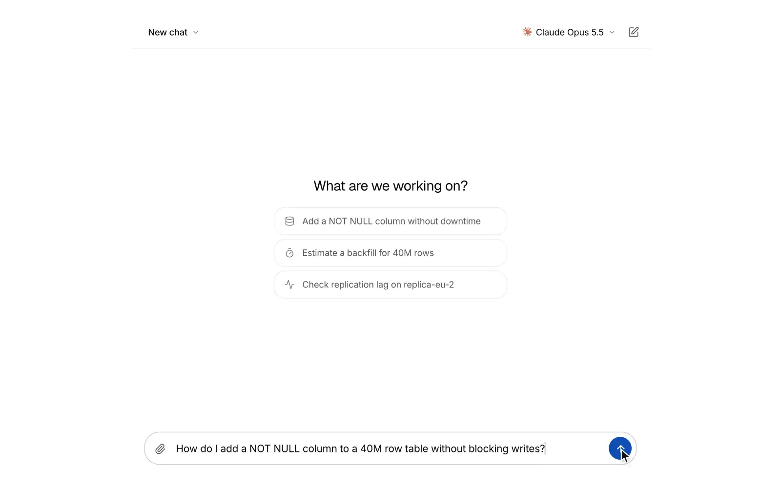 AI chatProBlockA full-screen AI chat where answers stream in as markdown with folding reasoning, tool chips and cited sources. People can switch chats and models, edit or retry a message into versions, rate replies and stop a reply mid-stream.